Suitability Report Format
Ed Evans
Continuing on from last week when I looked at how to structure your suitability reports, this week I’m going to explore how making a few changes to your suitability report format can not only make them more reader-friendly and engaging, but also more closely aligned with your personality and brand.
Font
There are two basic types of font you will want to consider for your reports – serif (e.g Times New Roman, Georgia and Century) and sans-serif (e.g Arial, Calibri and Verdana). First and foremost, use a font that’s easy to read – serif fonts are generally considered to be slightly easier to read than sans-serif fonts, but also think about what the font says about you and your brand – sans-serif fonts are typically less formal than serif fonts. You may even wish to consider combining the two – using a sans-serif font for your titles and headings and a serif font for the main body text.
Page alignment
Fully justified text is generally considered more formal and some people think it looks neater. However, left aligned text is considered easier to read and provides greater white space. Personally, I don’t think there’s a lot in it and it probably just comes down to personal preference.
Images
“A picture is worth a thousand words…” Not only are pictures often easier to understand than words but they break up the text. Adding high quality images to your reports will provide greater visual interest and help stimulate the reader’s attention.
Tables
I like to use tables whenever possible. Much like images, tables help to break up the text and create visual interest. Tables also present information in a much clearer and well-organised manner.
Colour
Personally, I’m a huge fan of adding colour to a report. Consider adding colour to your tables and headings, but again be sure to pick a colour that reflects your personality and brand.
Bullets
Use bullets wherever possible. They are easier to read and digest than long sentences.
Bold, italic and underline
Much like I’ve done in this blog, use bold, italic and underline to highlight key points and important information.
Ok that’s it for this week. Next week I plan to look at the language and wording you should use in your suitability reports.
As always, if you got a spare minute, please leave a comment – I’d love to hear your thoughts.
Make sure you don’t miss the next instalment – subscribe and get email alerts when we update our blog.
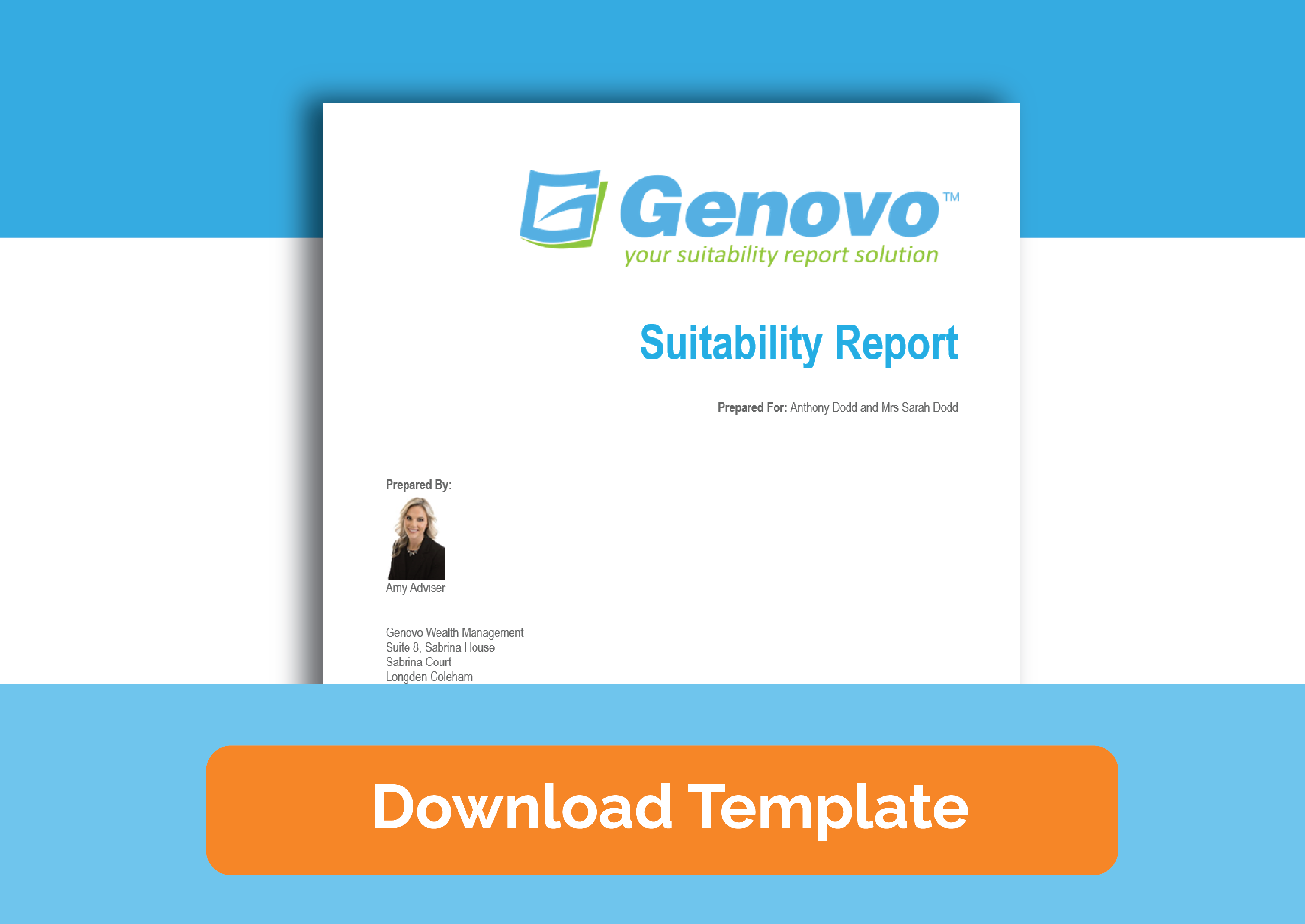
Many of the concepts I’ve written about in this series of blogs are highlighted in our suitability report template. See how you can make your suitability reports more reader-friendly and engaging – download your free suitability report template here.
Share this post
Free suitability report template
Learn how to make your reports more reader-friendly and engaging.
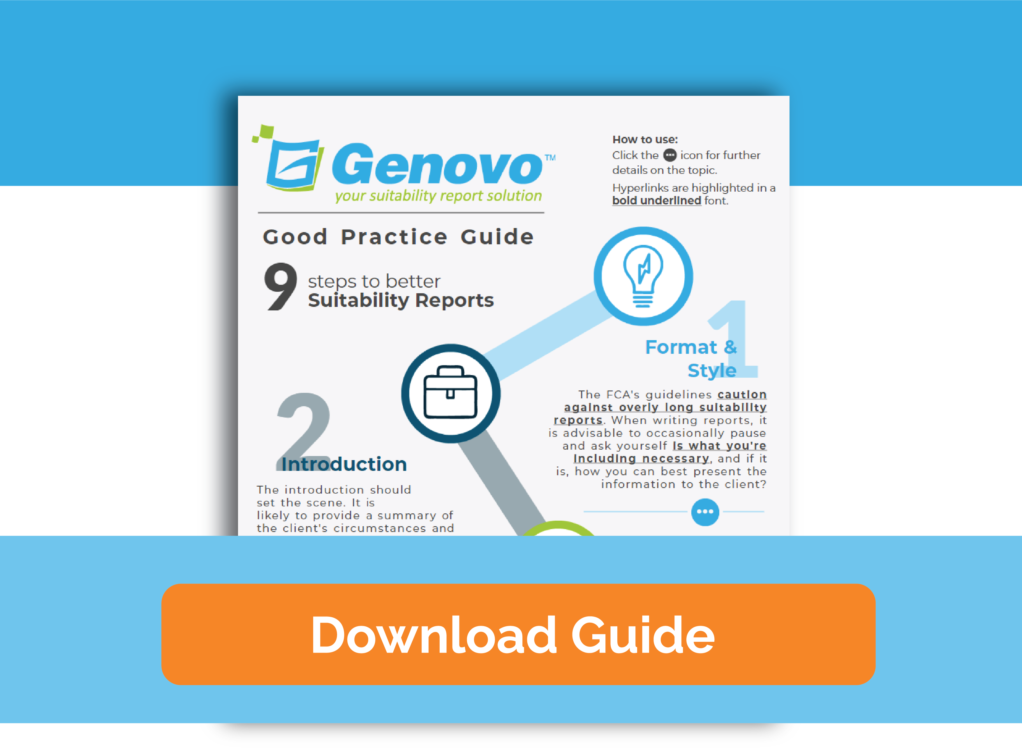
Suitability report best practice guide
Download the interactive guide and follow our 9 steps to better suitability reports.